Less is more in advertising
There comes a time when we all just want a bit of space. Some time away from all the stuff and things you need to register, process, and react to to get you through the day.
It’s human nature. An area of study in the late 60s when environmental psychologists began to study how humans interact with their surroundings, and the effects different environments have on both experiences and behaviour. The space we’re in really does have an effect on how we think, feel and act.
Environmental psychology has been applied to everything from prison design, to museum layout, to understanding territorial behaviour. And interest in the area has spiked since people began working from home. Studies show people generate more ideas for novel and useful solutions to creative problems when they’re at home than in any other single environment. This is thanks to a link between physical expanse and creativity.
It’s believed our physical space (as it actually exists or is perceived) stands in direct proportion to our mental space. This allows us to be more open to new ideas. Space and perception are connected. And allows our very impressionable minds to respond to things as much for what they imply, as much for what they literally are.
So, how does this apply to advertising?
Well, it’s a way of me trying to make the point that: Space. Is. Good. Something I’ve noticed is really difficult to explain when it comes to advertising. If physical space and mental space are so closely linked (so say the scientists), then this angle has to be worth a shot.
I’ve watched so much beautiful creative get shot down because it’s too ‘empty’. Add a strapline, a flash, some smallprint, some more copy, another image, a bigger headline! It almost feels like a race to see who can colour the gaps in quickest. And, it’s a natural reaction, particularly with ads becoming smaller and competition getting bigger. We want to say so much in tiny spaces. But as I’ve mentioned in past blogs, this isn’t something our brains always appreciate, and busy, literal ads risk being ignored altogether.
Doubters
Please can I assure all the doubters now that space – white, negative, whatever you want to call it does not appear in ads because we can’t think of anything to fill it. It’s there, and works, if creative is good enough to capitalise on it.
Good, effective ads have a narrative, and use images and words to lead people to the information they need. Overlaying a good, effective use of space can help to guide them to the focal point of an ad. It helps them build their own ideas, and ultimately interpret and retain messaging in a better way. This can take a couple of seconds, but that’s all you need.
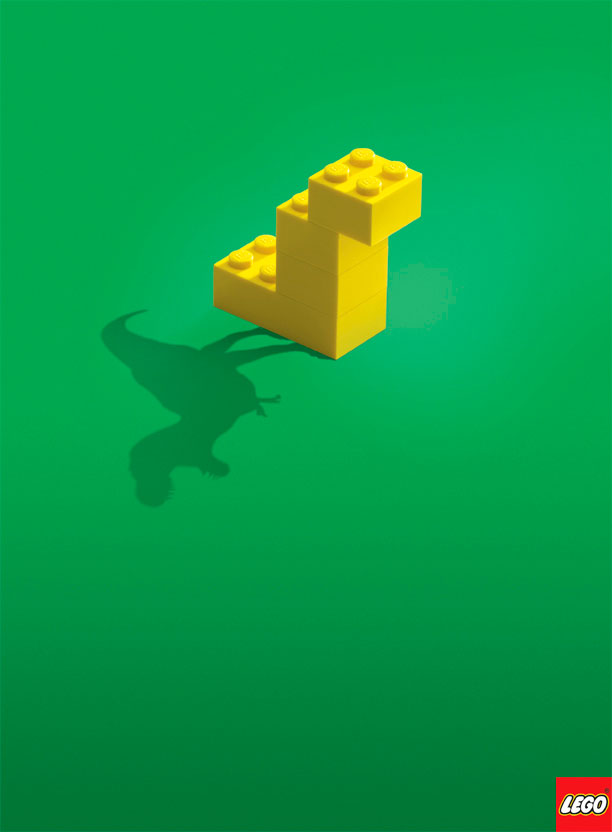
This is one of a series of superb ads from Lego that beautifully communicates the sentiment of freedom and imagination with no faff. Your only focus is all you need to focus on.

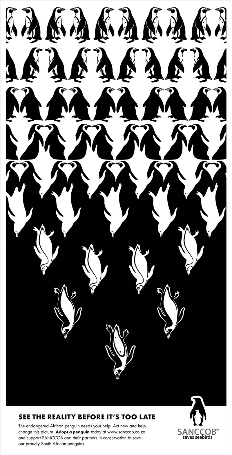
A different approach, but same principle, where space is used to add meaning without adding too many extra elements to the design.


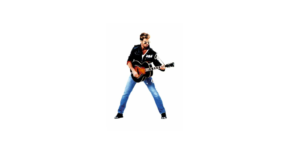
All these ads tell a story, aided by the use of space that gives our brains a chance to focus on and interpret the desired message. They have focal points that have room to breathe.
The art of using space is something that really does take an expert eye. Even more so today when ad space seems to be sold by the pixel rather than the inch.
Still not convinced?
That’s ok. But just remember next time you head to a fine dining restaurant. You’ll be paying a lot more for the delicate portion in the middle of a vast white plate than you would have done nipping down your local for steak and chips. And there’s a reason for that 😉
So when it comes to space being bad, I’d urge you to reconsider this foolish notion.
Less is more in advertising
If you’d like to give us a little space in your diary for a chat, drop us a note saying: ‘ ‘ here.
