Sans woke if you please.
In December 2025, the US state department (headed up by Secretary of State Mark Rubio) pulled a long face about a certain typeface.
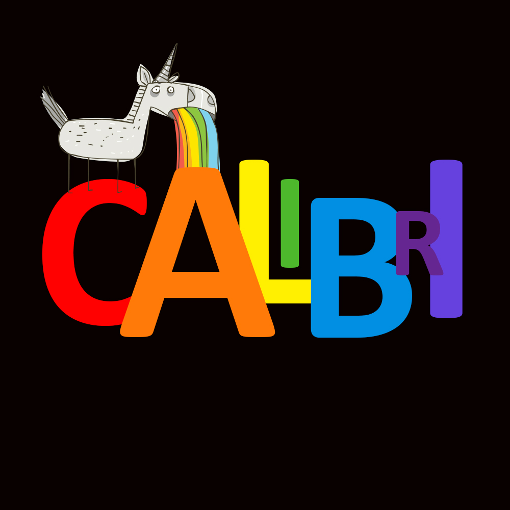
‘Calibri’ had been the font of choice for the state department since 2023 – coincidentally while Joe Biden was in power.
Clean, modern and accessible was the thinking. Well at least to some.
But Rubio wasn’t having any of it.
He branded the typeface an emblem of wasteful diversity and ‘wokeness’ – subsequently ordering an immediate return to Times New Roman. He boasted this would herald the welcome return of ‘decorum and professionalism’ to all state documents. It was also later admitted to be part of a wider initiative to ‘hunt down’ exponents of DEI across the administration.
NB: I should point out here, for the pedants amongst us, that a font is a stylised version of a typeface – like when Times New Roman (a typeface) spawns derivatives versions such as Bold, Regular or Italic (these are fonts).
Now I’m no designer. I’m no typographer either for that matter – but I greatly appreciate how fonts contribute hugely to tone of voice, authority, humour and persuasion when used in the right context.
I’ve also heard fonts called many things, playful, stern, sober – but never ‘woke’.
So US state department, you much revered powerhouse of democracy you – is this your finest hour as the font of knowledge?
Or has your decision only served to lose you even more face?