On the road again. This time with flibco.
We are delighted to announce that we’ve secured a major pan-European brief with flibco.com, the European airport transfer brand in partnership with our Birmingham-based friends at SHC. Winning this competitive pitch against international agencies is such a testament to the creative talent here in Birmingham, UK. Together, we are launching a robust paid social and …
“Beware of little expenses; a small leak will sink a great ship”
Written by Beth Menear, Account Director. I’ve been watching “Lucy Worsley Investigates: The American Revolution” because it’s bloody hot and I couldn’t be all that bothered to change the channel. It was good though, and the Benjamin Franklin phrase stolen for the title of this stream of consciousness seems actually quite apt as I’ve also …“Beware of little expenses; a small leak will sink a great ship” +

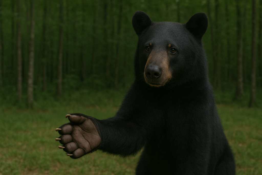
Best Funerals appoints One Black Bear to bring brand to life.
We’re absolutely honoured to have been chosen by Best Funerals to help develop their new brand identity. We were first approached last year about the project and are thrilled to have been appointed to design and develop the brand architecture for this industry disruptor.Best Funerals appoints One Black Bear to bring brand to life. +
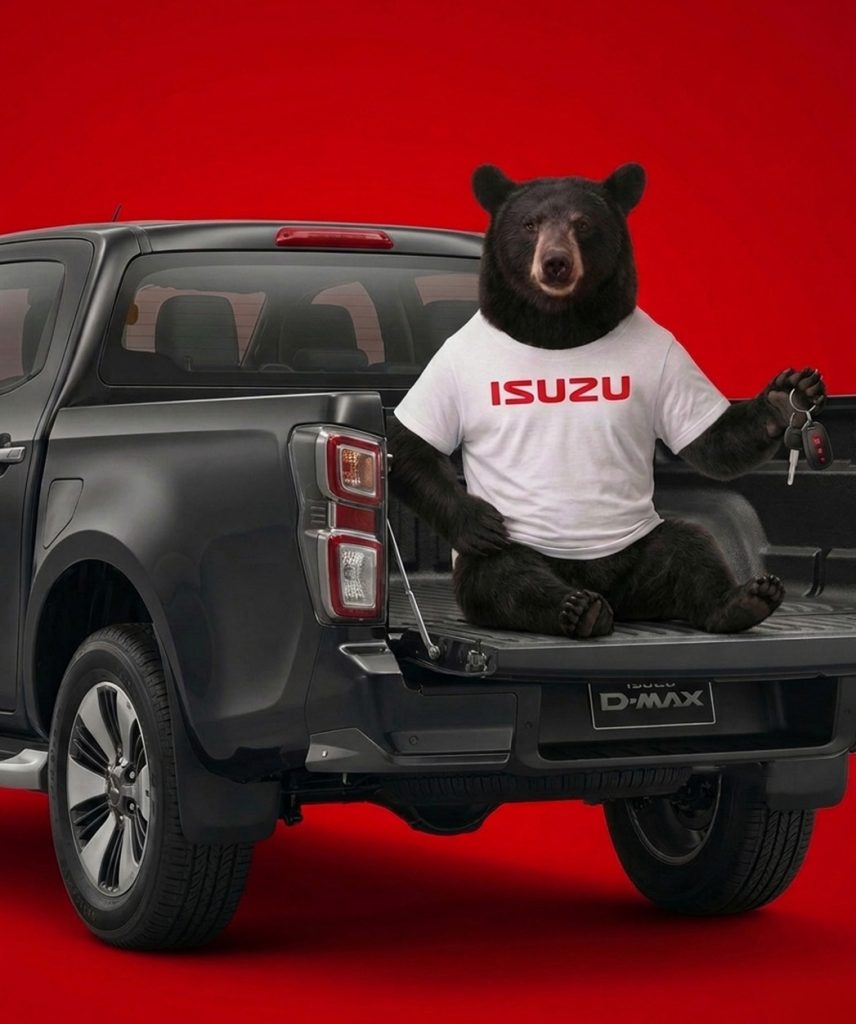
Isuzu pick-ups pick One Black Bear
We’re proud to announce that we’ve picked up a pick-up client. After a competitive pitch, we’ve been appointed by Isuzu UK to handle their website at a really exciting time as they launch the new D-Max EV. We’ll be developing a whole new UX as well as handling all the back end build to generate …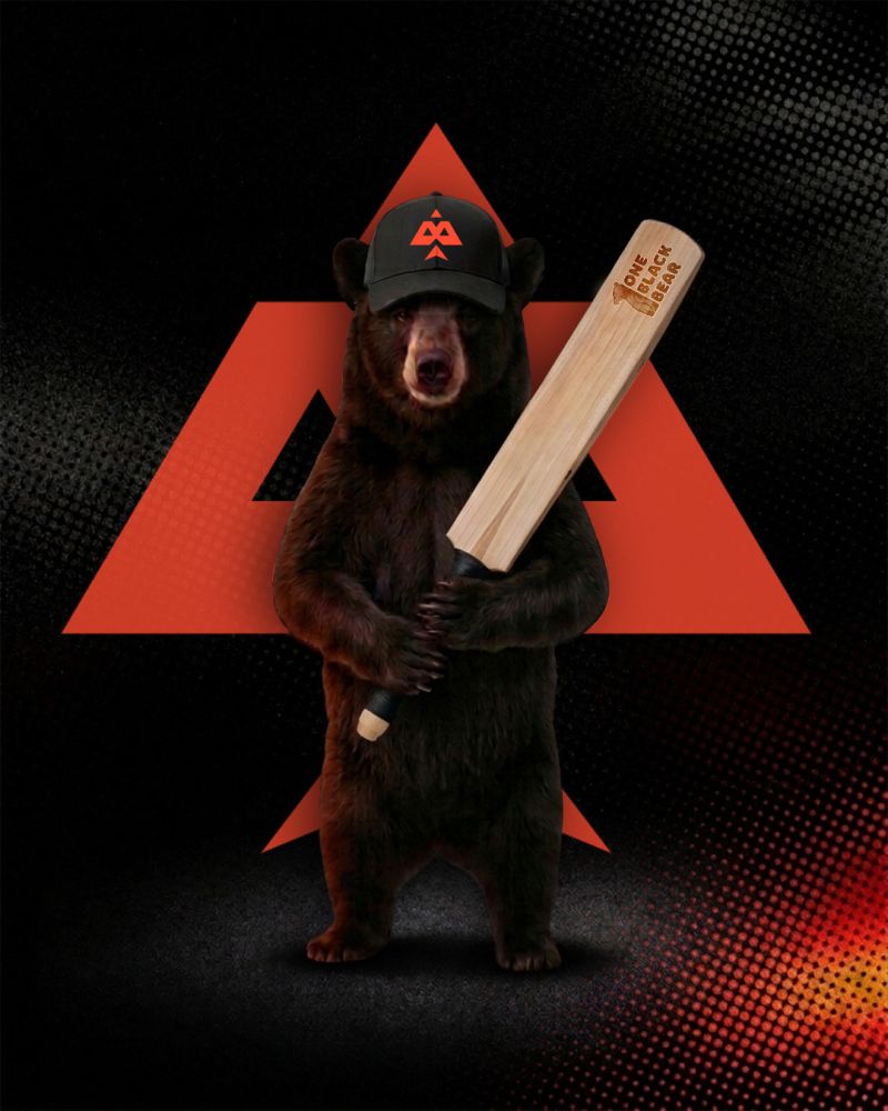
Bears are on Fire with Birmingham Phoenix win
We’re proud to announce that The Birmingham Phoenix has landed at One Black Bear after a competitive pitch. 🔥 We’ve padded up once again to hit it out of the park and build on our amazing work with Warwickshire County Cricket Club and help take the Phoenix fanbase to the next level. We’ll be smashing …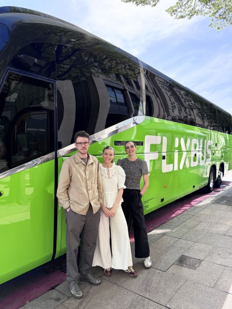
FlixBus UK begins journey with One Black Bear
We’re thrilled to announce we’ve been appointed by the wonderful team at Flix to create their biggest UK campaign to date! Following our pan-European collaboration in 2025, we’re back encouraging the UK to “Switch to FlixBus” through a bold, cheeky, and high-impact campaign launching next week 👀 We’ll be working with Mediaplus UK to truly …
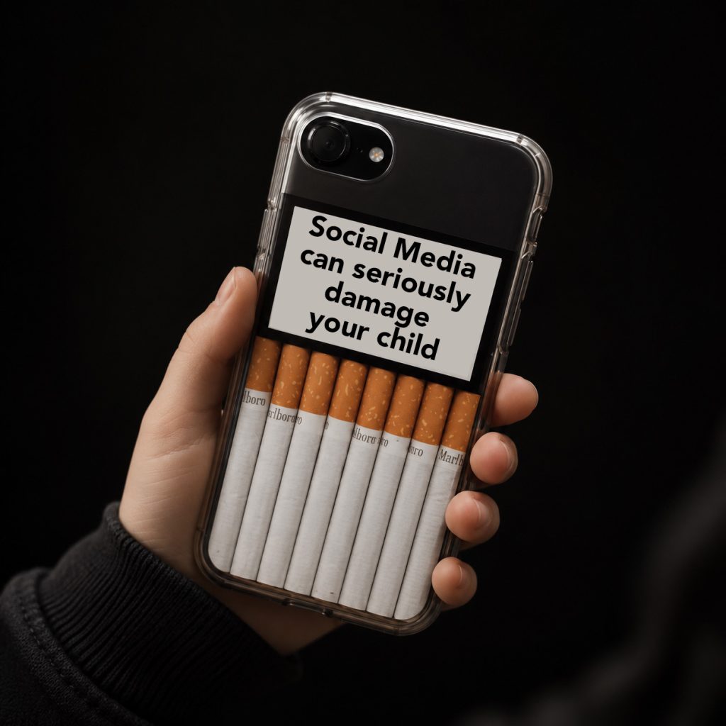
Beware the finfluencers.
You may well have seen Manosphere, Louis Theroux’s latest compelling and disturbing documentary on Netflix. If you have seen it, you may have reached the very same conclusion as quickly as I did: namely, that it’s all just about making money. Just hard dollar, and nothing more. Because whenever the characters in question were challenged …
Sans woke if you please.
In December 2025, the US state department (headed up by Secretary of State Mark Rubio) pulled a long face about a certain typeface. ‘Calibri’ had been the font of choice for the state department since 2023 – coincidentally while Joe Biden was in power. Clean, modern and accessible was the thinking. Well at least to …
A word about Brexit
Don’t panic, this isn’t a thousand words on the fineries of re-joining the custom union or soft cheese tariffs. Just a simple lesson from the past in regard to messaging. Now it may not feel like it, but we’re rapidly approaching ten years since that fateful day when we chose to leave the EU. Now, …
Is performance still performing?
The performance marketing landscape is changing. Fast. For the first time in two decades Google has seen a drop in search activity, with January 2025 marking the fourth consecutive month its market share sat below 90%. Of course they still have a monopoly, but there’s no denying this is a significant shift as new ways …