Are brands losing their identities?
Gumtree is the latest in a string of internationally recognised brands to launch a polished new look.
The redesign was carried out by London agency Koto and led by founder James Greenfield, who coincidentally worked on the Airbnb rebrand in 2014.
And the new look is very… nice.
But — while it’s an undoubted improvement on the outdated disaster of a logo they had been using since their launch in 2000, it seems to be the latest victim in the current trend for safe, homogenised marks.

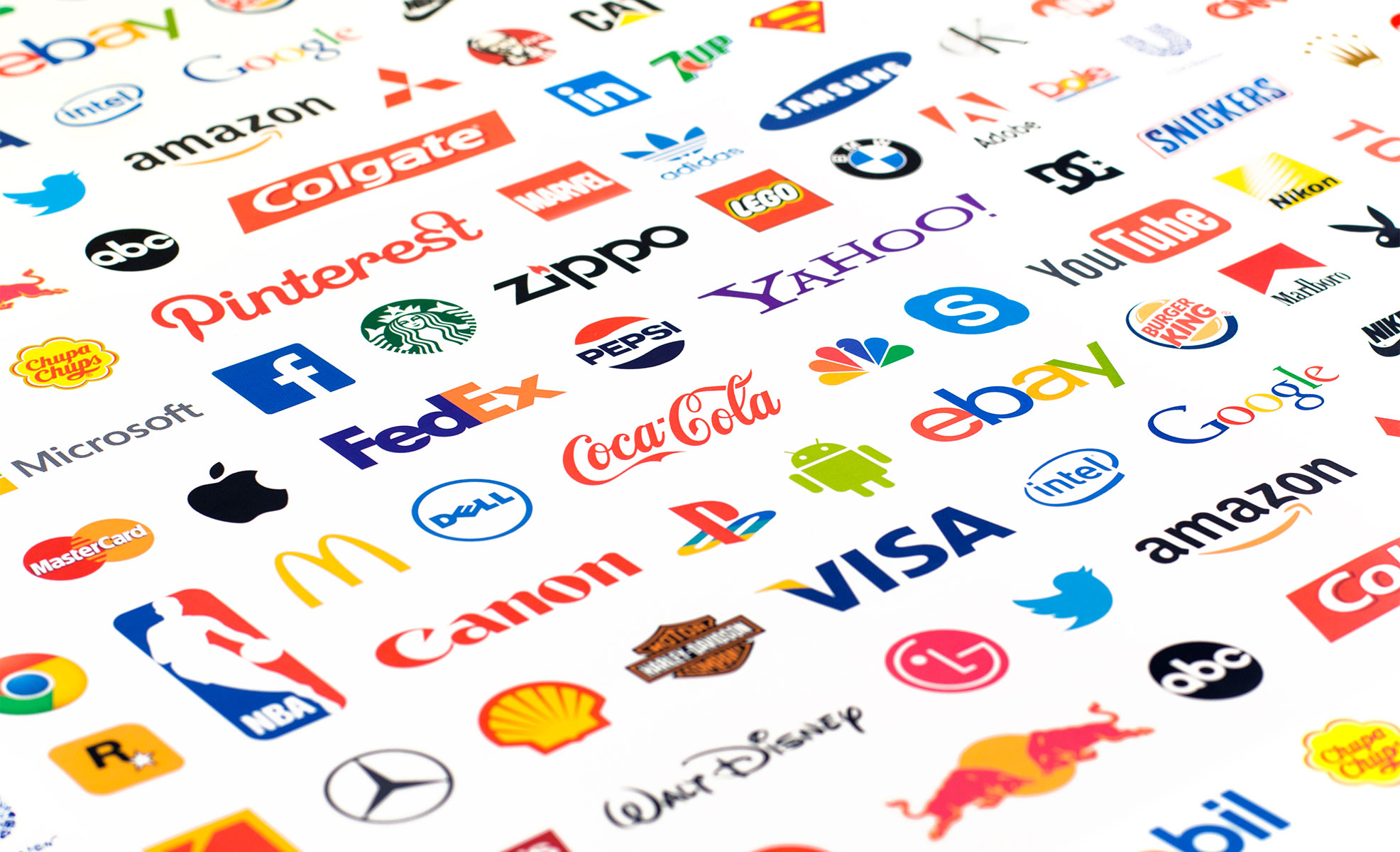
Take a look at some recent examples. Real giants of the digital world: Airbnb, Google, and Facebook. They’re beautiful and well considered, but they leave me, and many of the design community, cold. Where’s the personality? Where’s the idea?

Google have lost their trademark serif and looptail g, Facebook have reverted to a safe sans-serif (except, inexplicably for the f and k), airbnb have opted for a safe font and over-engineered icon named ‘Bélo’, and Gumtree have lost their signature eucalyptus tree in favour of a City Council-esqe bushy tree.
These types of rebrands seem to follow the same template: Choose a bold sans-serif typeface and use it in lowercase to give the facade of friendliness to corporate giants; add a geometrically well considered but slightly boring insignia which will look great on mobile apps; and where possible, abandon corporate colours for brighter palettes to give a fresh and modern feel.
The sad result is that these brave and pioneering companies are beginning to blend into one bland and sanitised corporate blur.
And they’re not alone — Aol, eBay, and Microsoft have all moved to safer ground in recent years.

So, how do companies rebrand successfully? Is there a way to navigate the transition to a more modern look without relying on the same fashionable template? Is it possible to evolve the brand without losing what made it unique in the first place? I think so. Here are a few names that have managed it:
Argos: 2010
Shopping giant, Argos, pulled off a subtle rebrand in 2010. They managed to update to a more modern look while retaining the essence of the brand (the familiar swoosh and corporate colour), which resulted in a sleek but friendly style.

Trainline: 2015
Although Trainline chose the ubiquitous sans-serif font, I think they pulled it off due to the clever rail intersection they worked into the ‘t’. I also like that they were confident enough to lose ‘the’ and ‘.com’ from the logo. The result is an updated and sleek look but one that retains some personality and wit.

ITV: 2015
ITV’s rebrand last year was a success on many levels. They updated from a very corporate look to one that appeals much more to consumers without resorting to a fashionable typeface. The flexible colour palette also means that the mark will always look good alongside programme imagery.

Channel 4: 2015
And finally, Channel 4 recently revamped their look with some clean and quirky typography, complemented by some clever idents that bridge the gap between their iconic building block logo and the new type. But then, you’d expect no less than perfection from design hero, Neville Brody.


The future of rebranding
It’s human nature to replicate a look that has worked well for others, and it’s inevitable that international brands with stakeholders to keep happy will fall back on a formula that’s safe and proven.
But – a visual identity is about personality and what makes your company unique; it’s about communicating your values and creating a emotional connection with your audience.
No brand should settle for something that positions them as just one of the crowd.